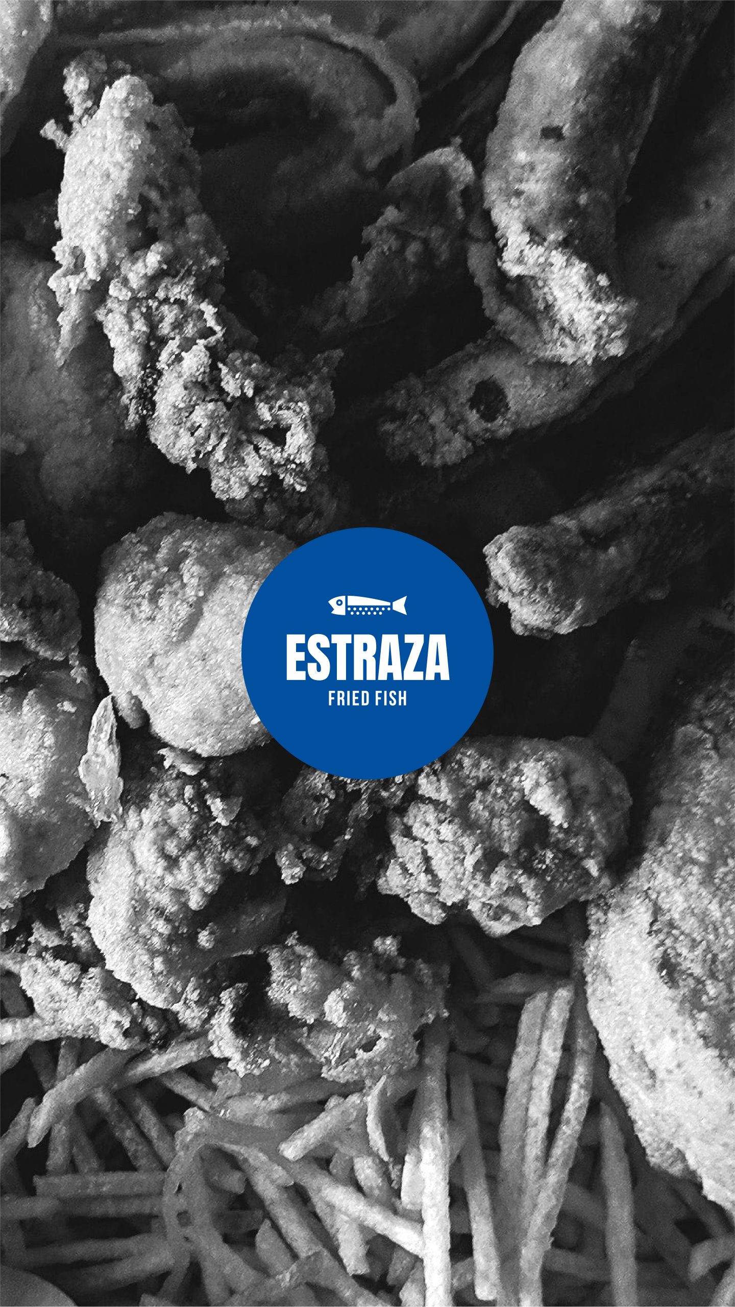
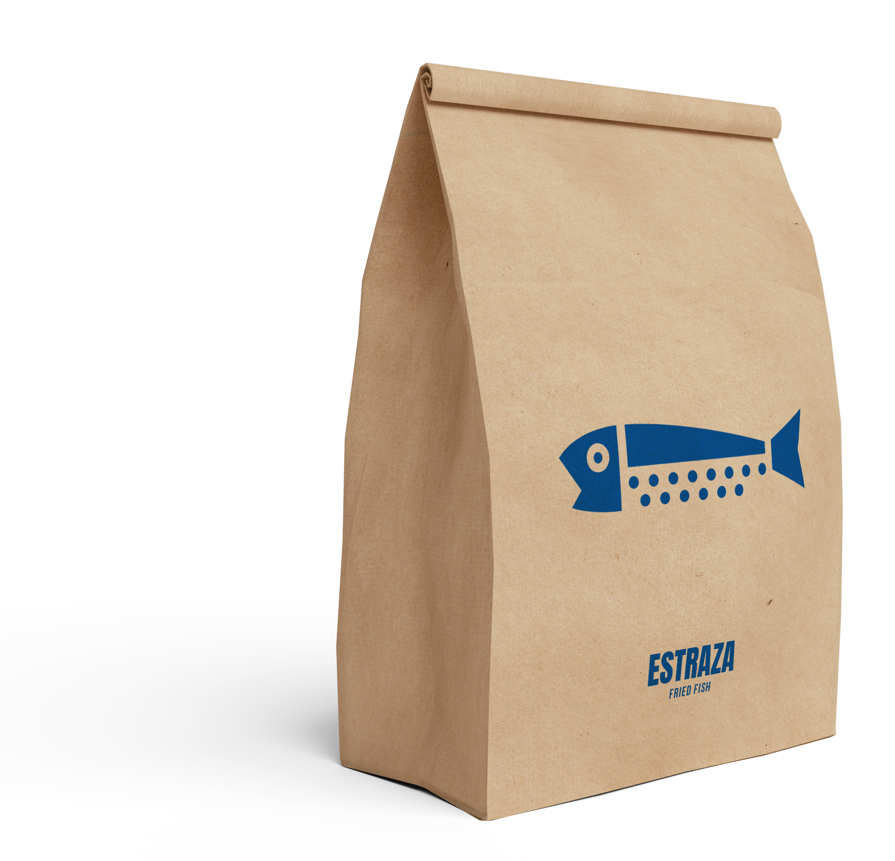
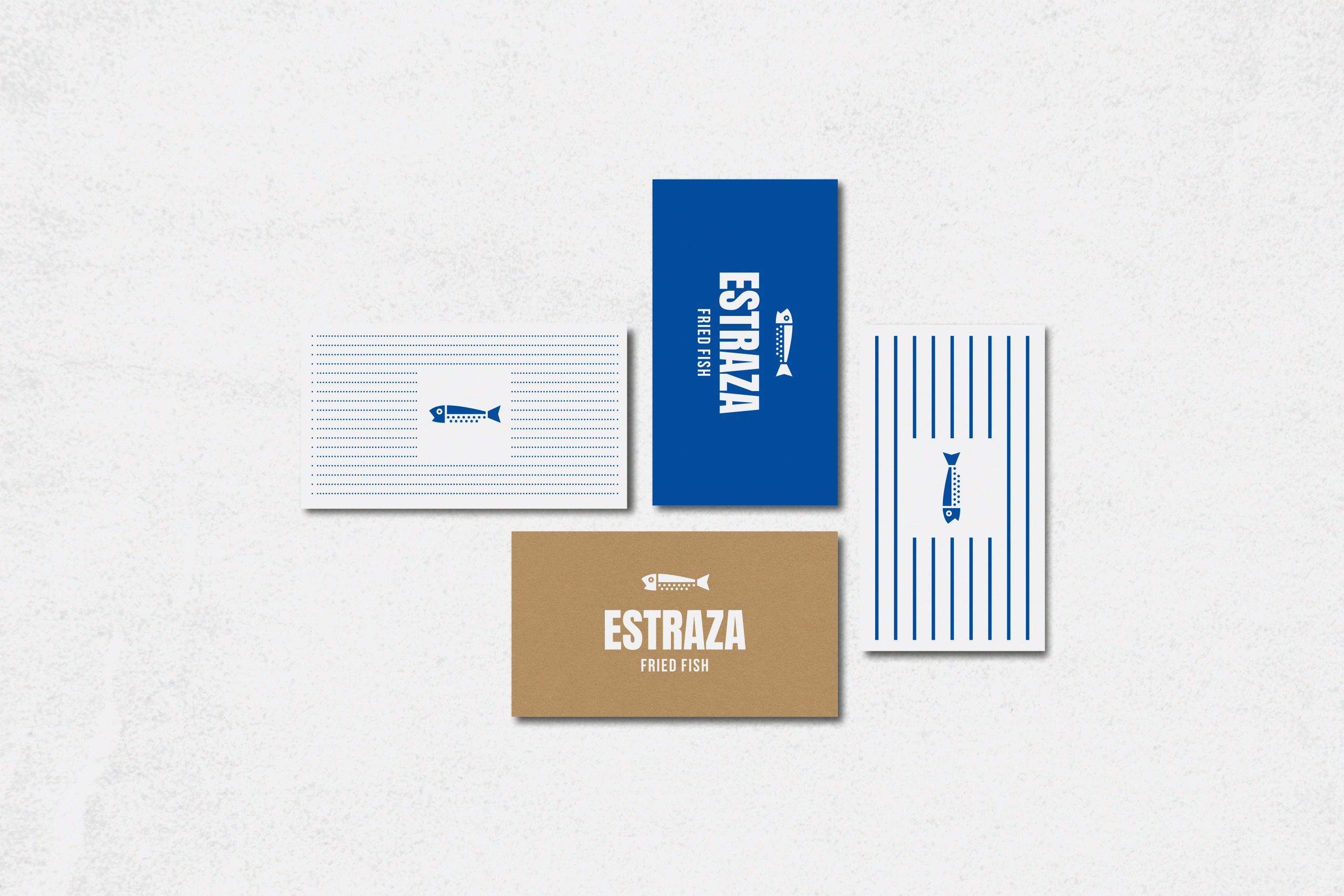
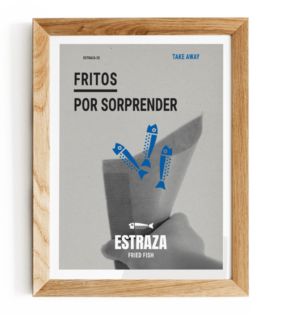
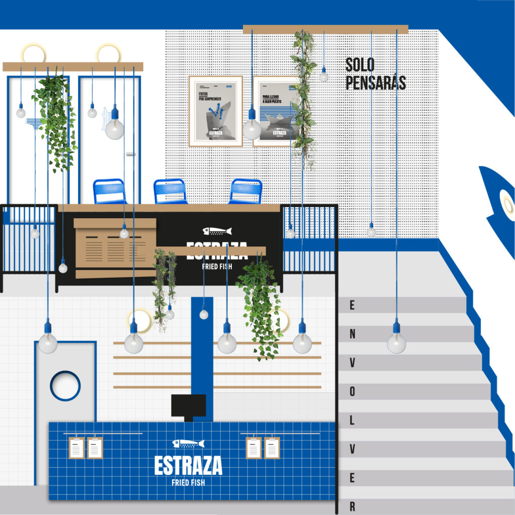
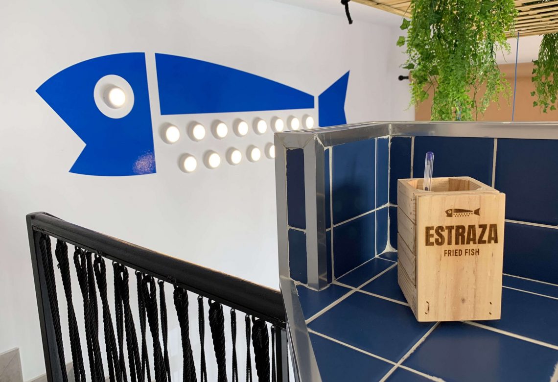
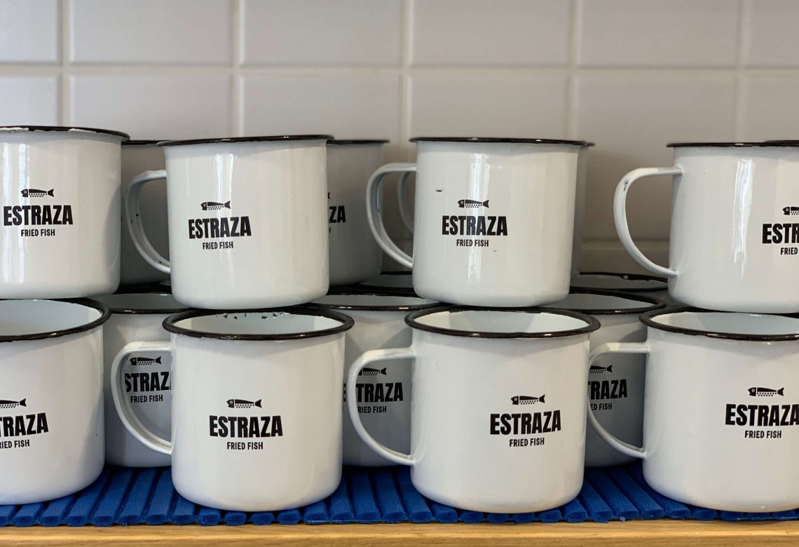
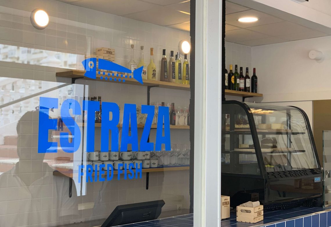
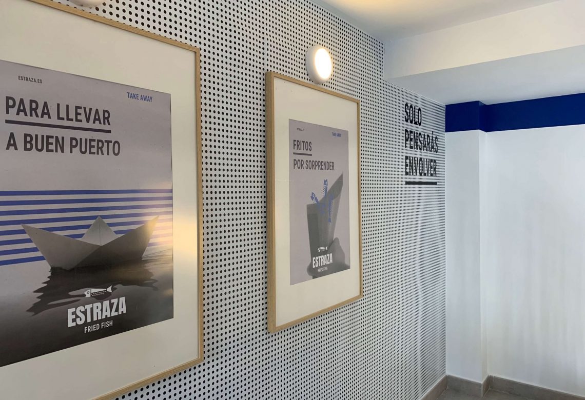
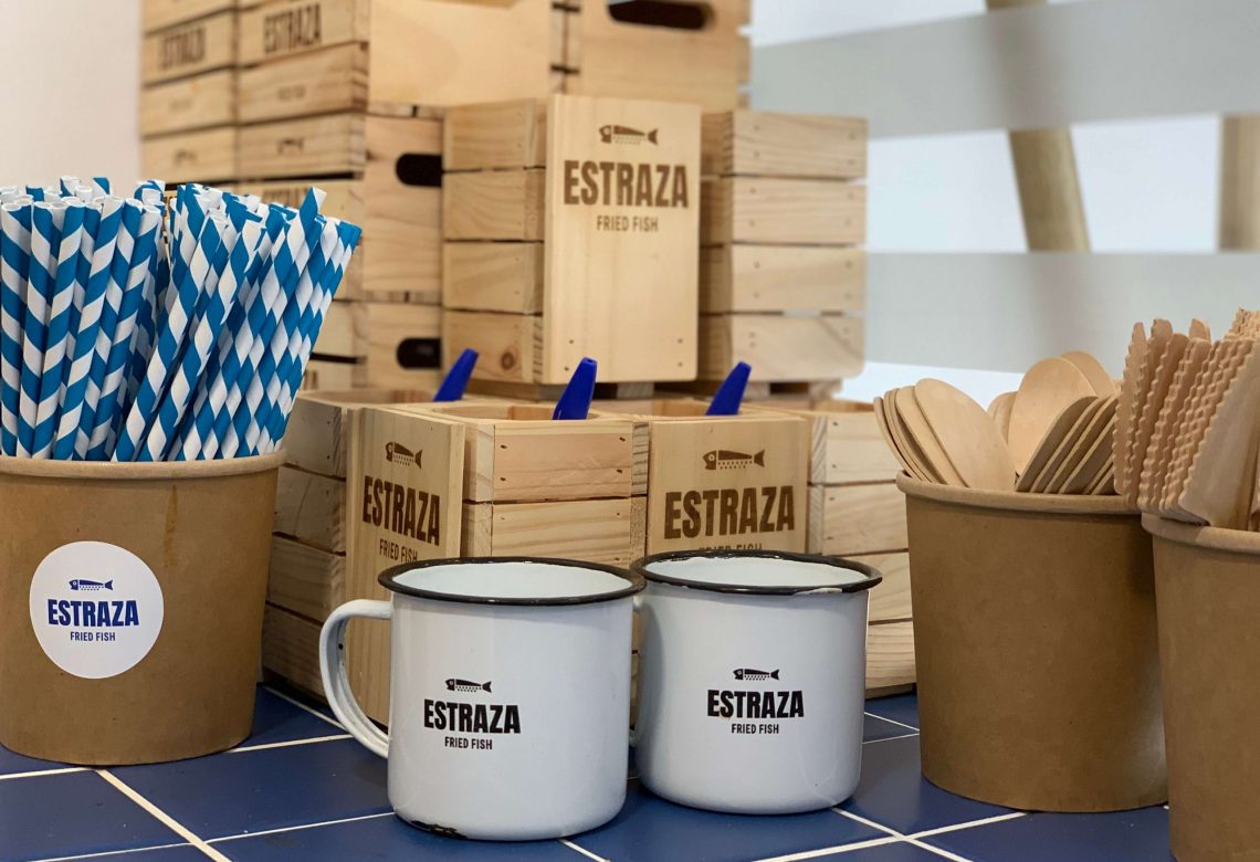
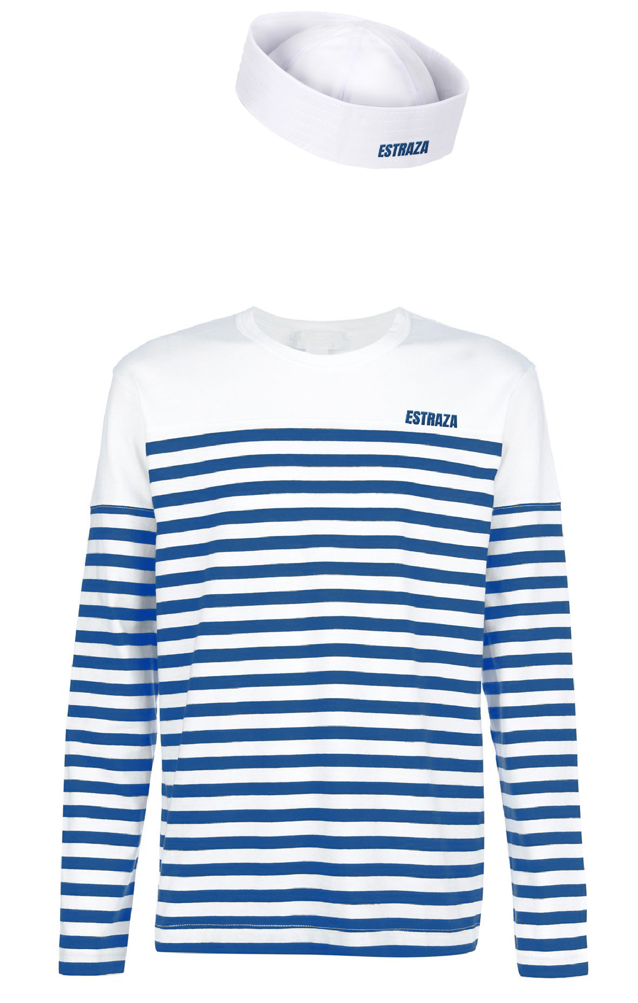
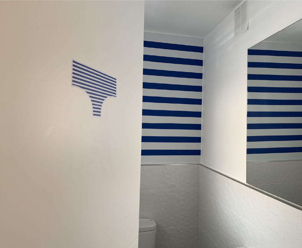
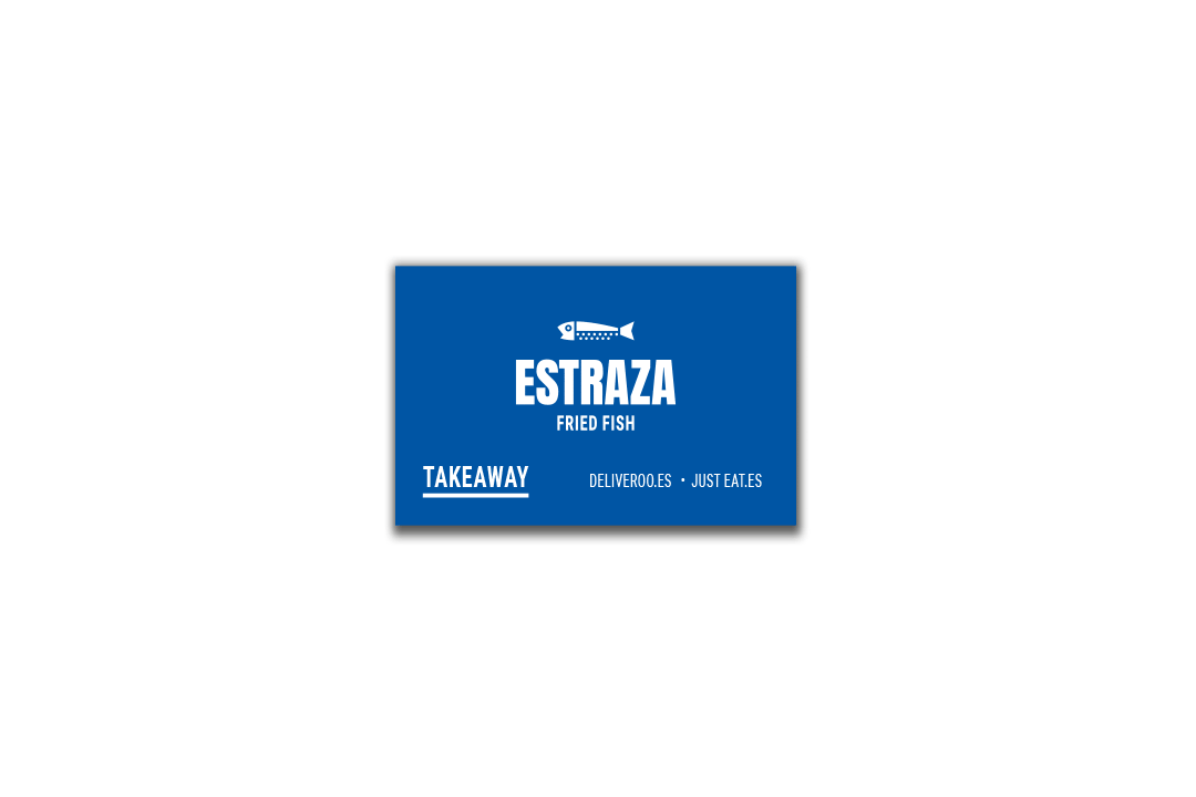
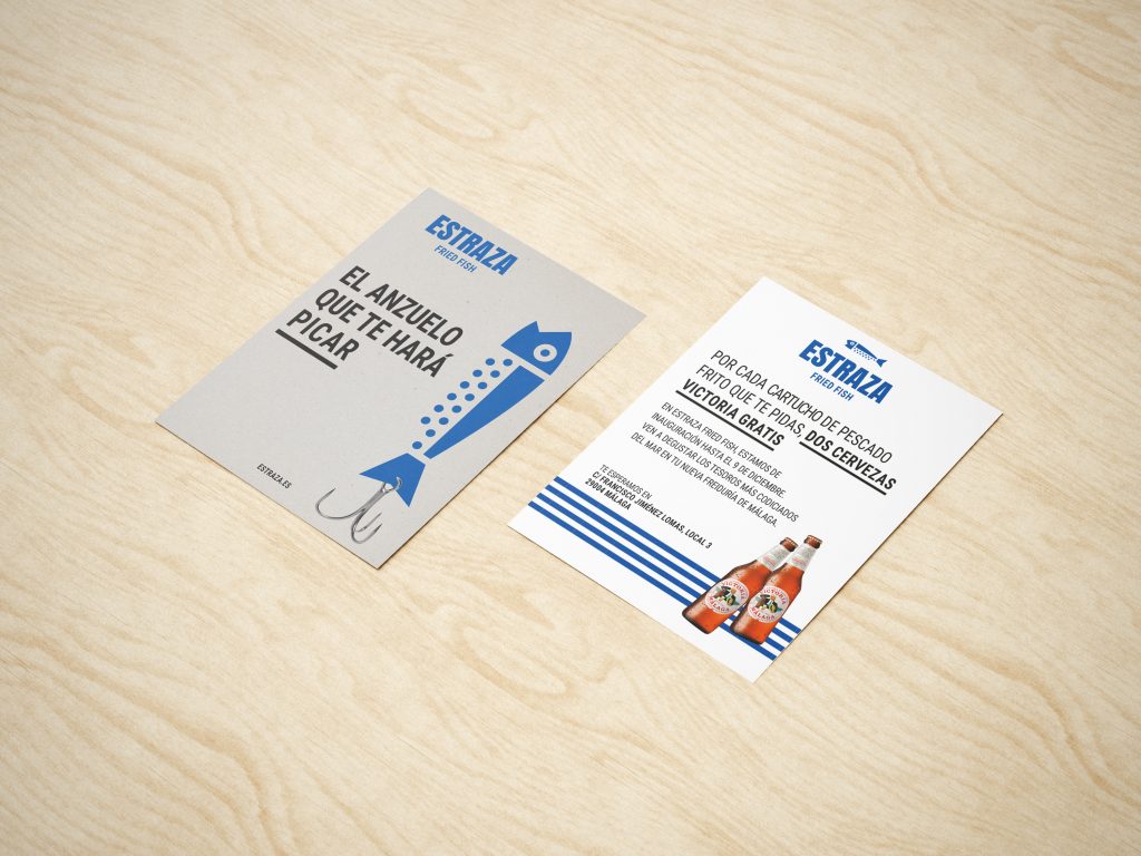
Estraza is a new concept for an establishment where quality fried fish served on trays lined with kraft paper is the specialty.
We took the Spanish name for the type of paper from these trays (“estraza” = “kraft”): emphatic, clear, direct, and unpretentious. From there, we created a visual identity able to be franchised which is strong, likable, and very iconic. The development of a claim, along with concepts inherent to the fish frying business for the establishment’s launch, rounded off and enriched the brand image.
MEDIA
PRINT
Local decoration, posters, grand opening promotional flyer, menus, merchandising, corporate stationery, signage, stickers, logo, textile ads.
DIGITAL
Website, Facebook, Instagram.
Play Video
Manage Cookie Consent
Utilizamos tecnologías como las cookies para almacenar y/o acceder a la información del dispositivo. Lo hacemos para mejorar la experiencia de navegación y para mostrar anuncios (no) personalizados. El consentimiento a estas tecnologías nos permitirá procesar datos como el comportamiento de navegación o los ID's únicos en este sitio. No consentir o retirar el consentimiento, puede afectar negativamente a ciertas características y funciones.
Functional
Always active
The technical storage or access is strictly necessary for the legitimate purpose of enabling the use of a specific service explicitly requested by the subscriber or user, or for the sole purpose of carrying out the transmission of a communication over an electronic communications network.
Preferencias
El almacenamiento o acceso técnico es necesario para la finalidad legítima de almacenar preferencias no solicitadas por el abonado o usuario.
Statistics
El almacenamiento o acceso técnico que es utilizado exclusivamente con fines estadísticos.The technical storage or access that is used exclusively for anonymous statistical purposes. Without a subpoena, voluntary compliance on the part of your Internet Service Provider, or additional records from a third party, information stored or retrieved for this purpose alone cannot usually be used to identify you.
Marketing
The technical storage or access is required to create user profiles to send advertising, or to track the user on a website or across several websites for similar marketing purposes.