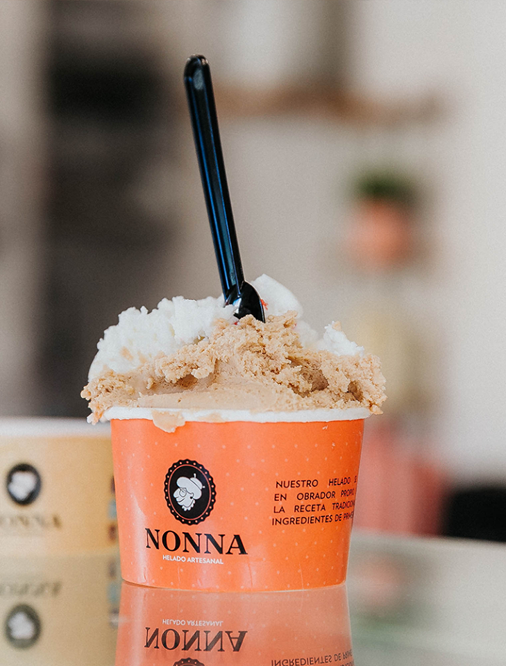
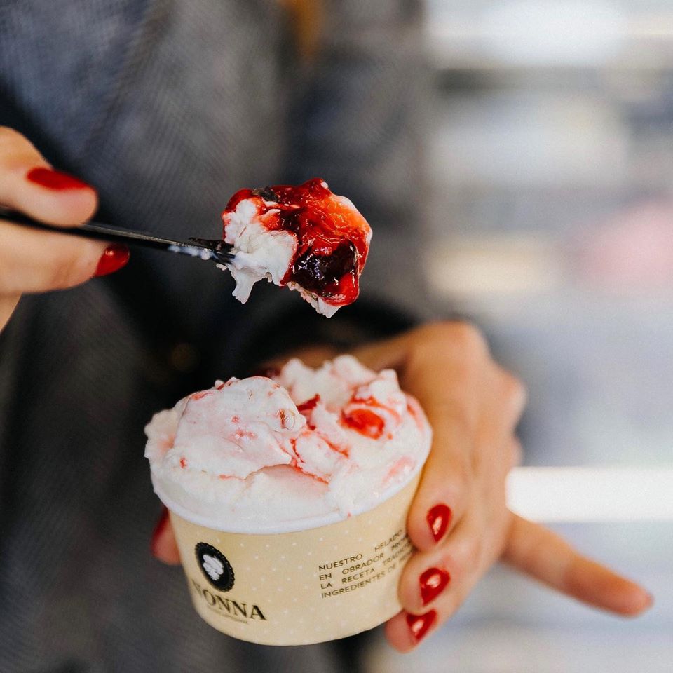
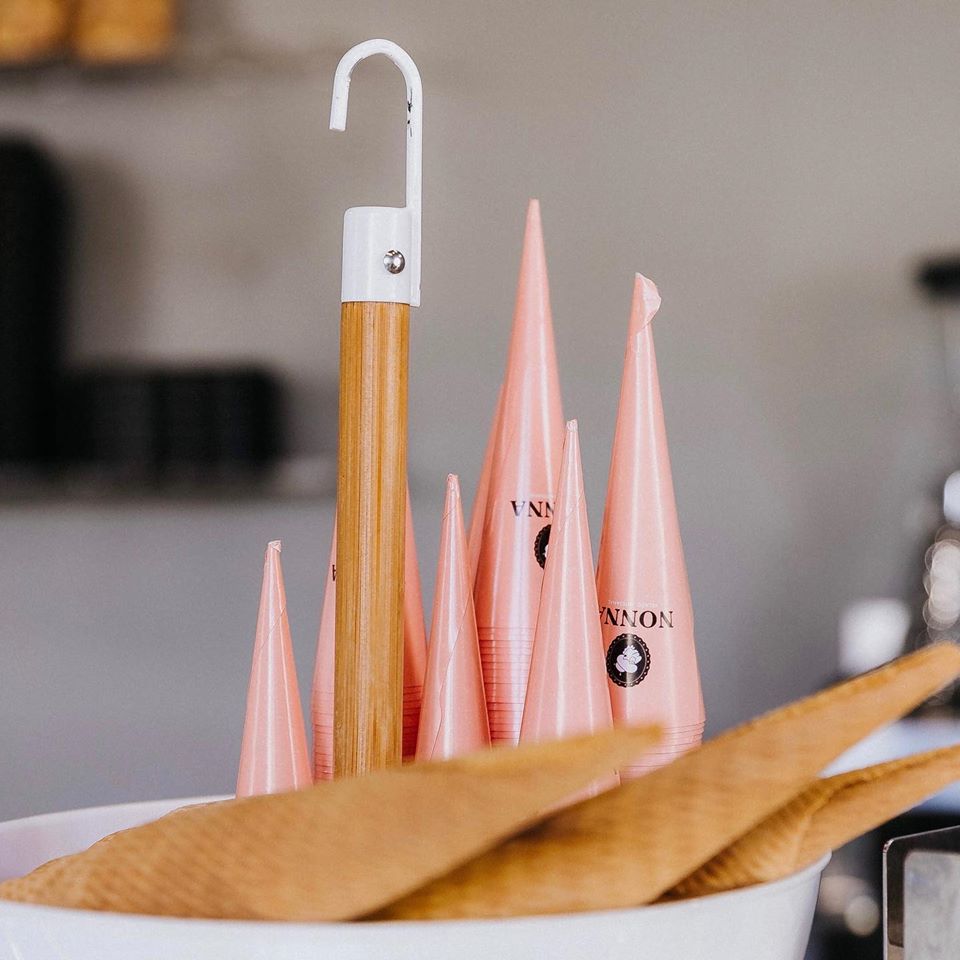
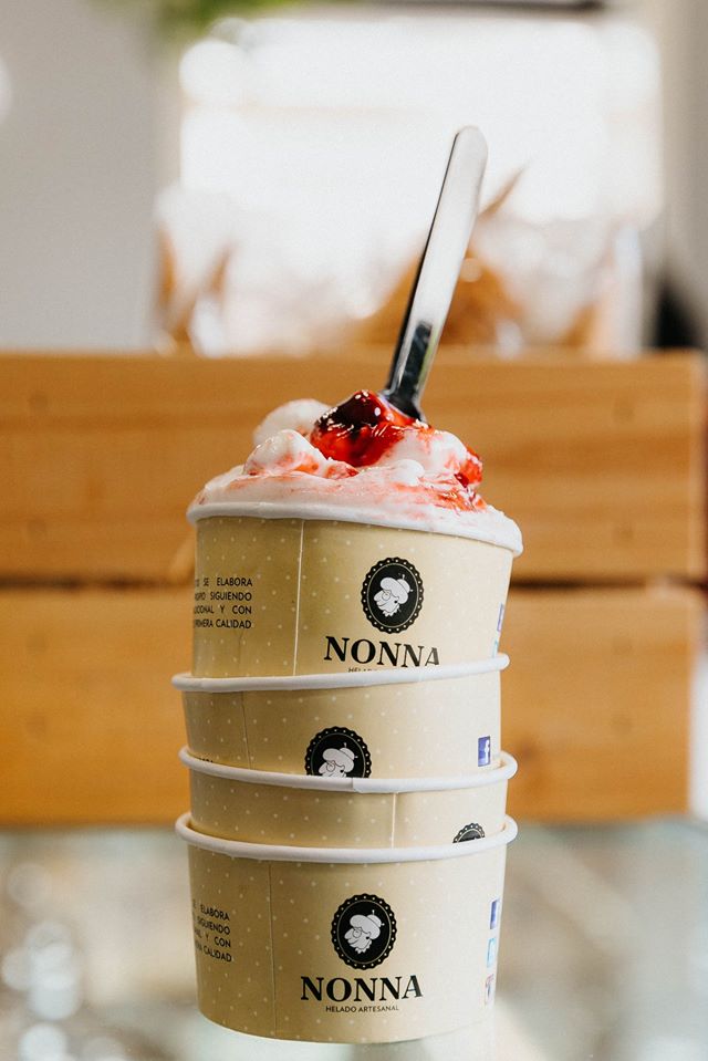
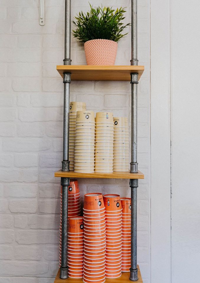
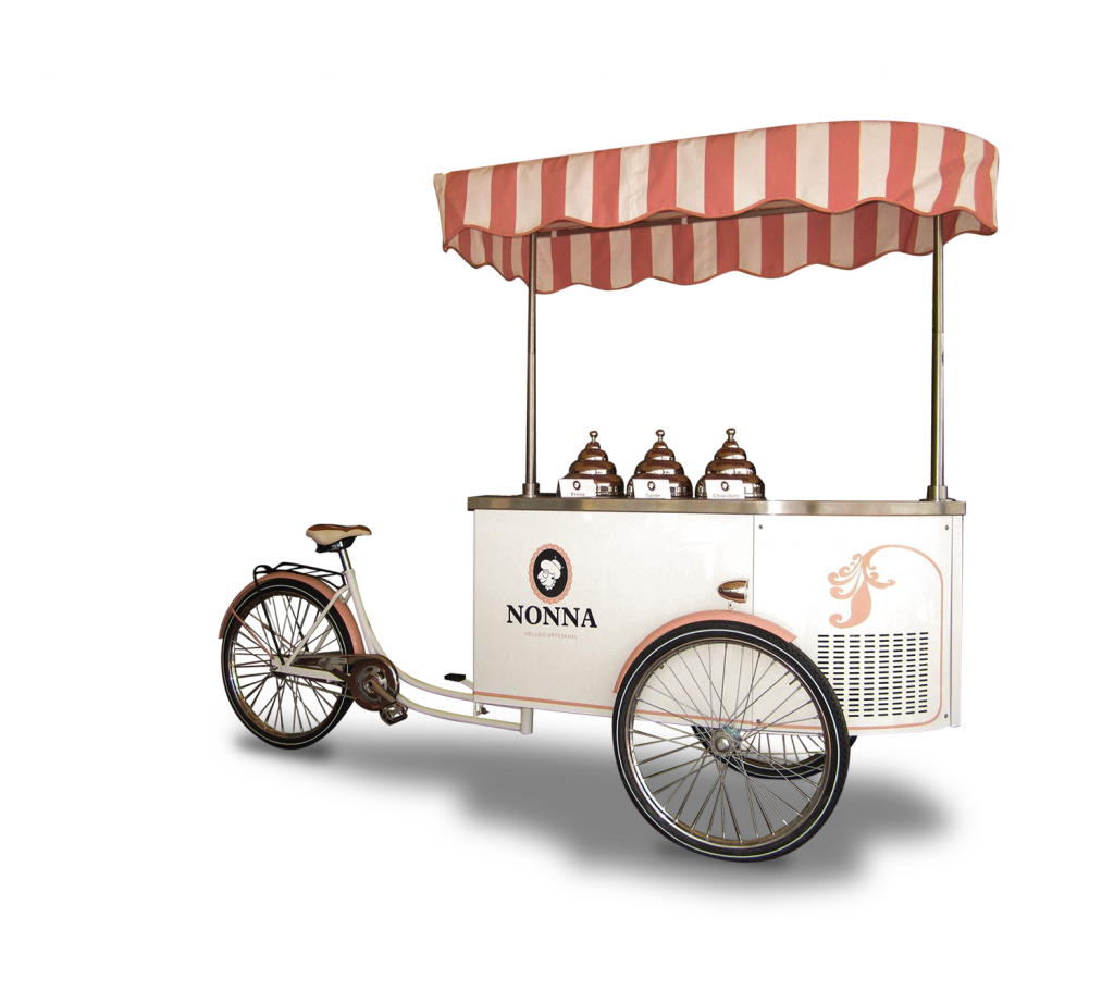
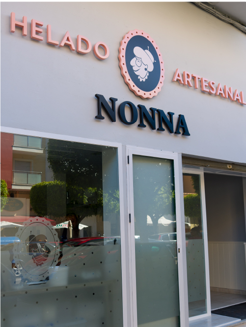
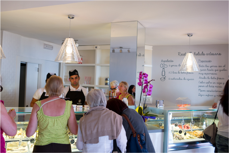
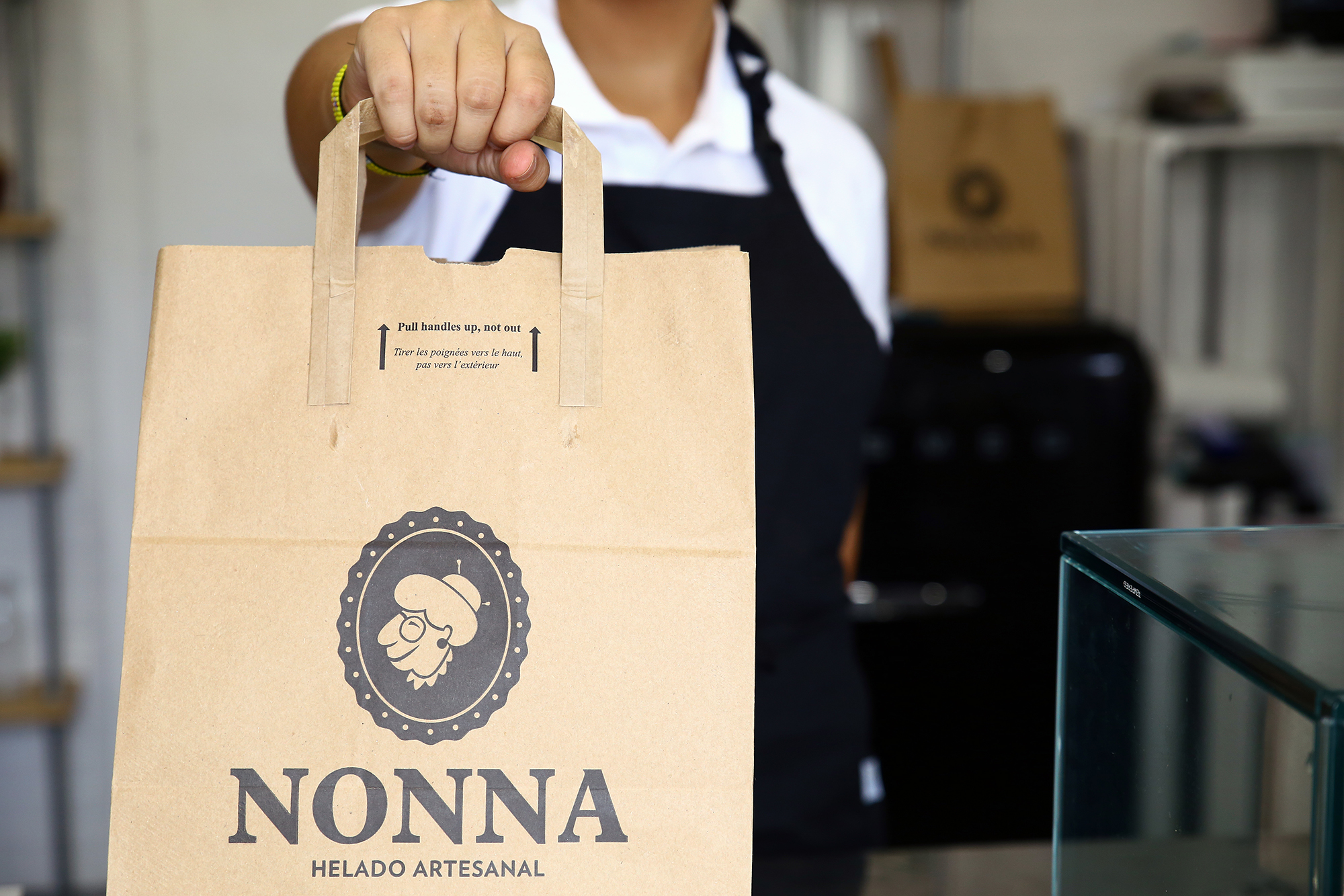
We did the naming, branding, and corporate identity for the NONNA traditional ice cream parlor. Full brand implementation (packaging and point of sale).
The client wanted a brand that would transmit the company’s values: tradition and quality. At the same time, they sought to transmit closeness, elegance, and modernity: a cool and fun brand that would make customers feel as if what they were going to try was an exquisite product of utmost quality – even before ordering their ice cream.
nonnaheladoartesanal.com